Featured Colours
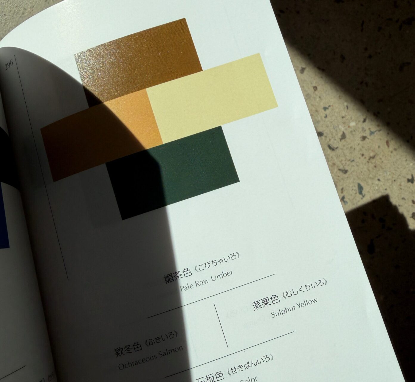
- Pale Raw Umber
- Ochraceous Salmon
- Sulphur Yellow
- Slate Colour
Reference Page: 205
Warmth Meets Depth
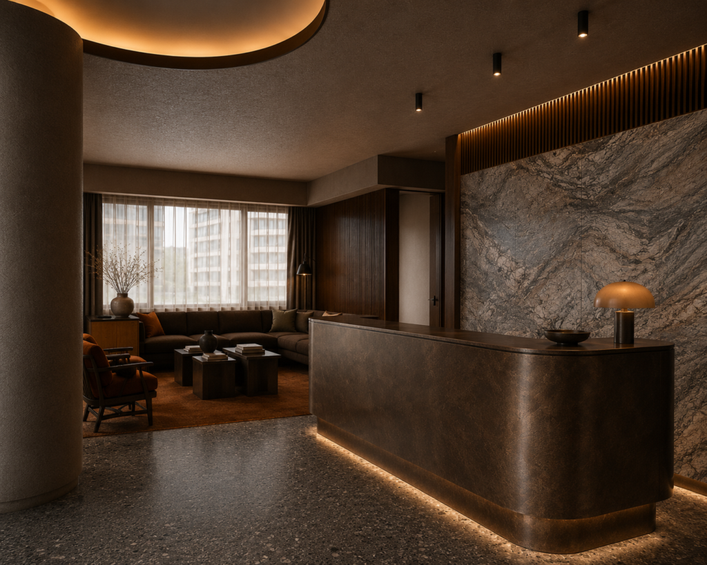
Issue 02 explores the relationship between warmth and depth, bringing together earthy tones with darker, moodier elements.
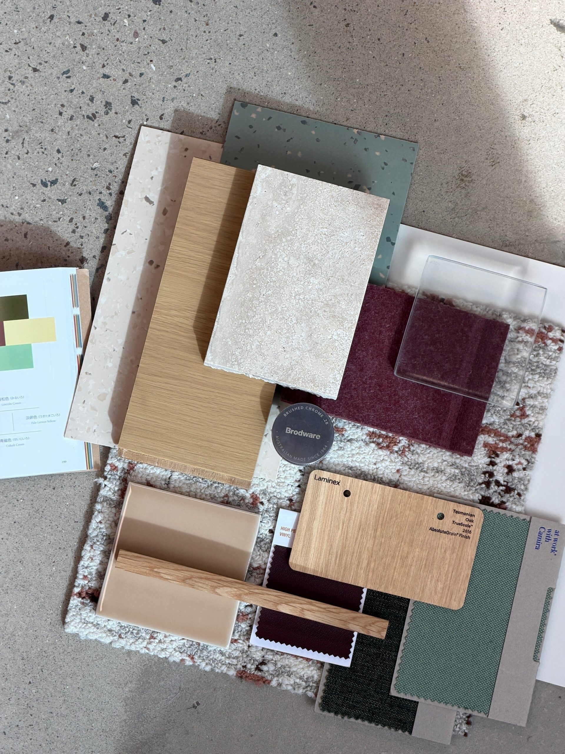
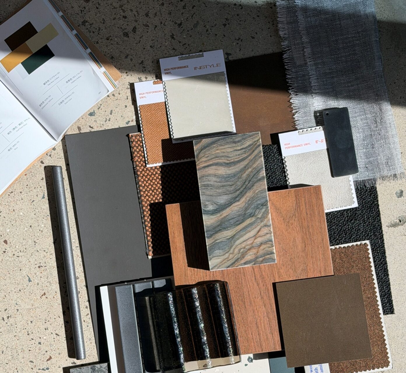
Pale Raw Umber, Ochraceous Salmon, Slate Colour and Sulphur Yellow form the basis of the palette, creating a scheme that feels grounded and warm while allowing for moments of contrast and intensity. The warmer tones bring balance to the deeper colours, creating a palette that feels rich and layered.
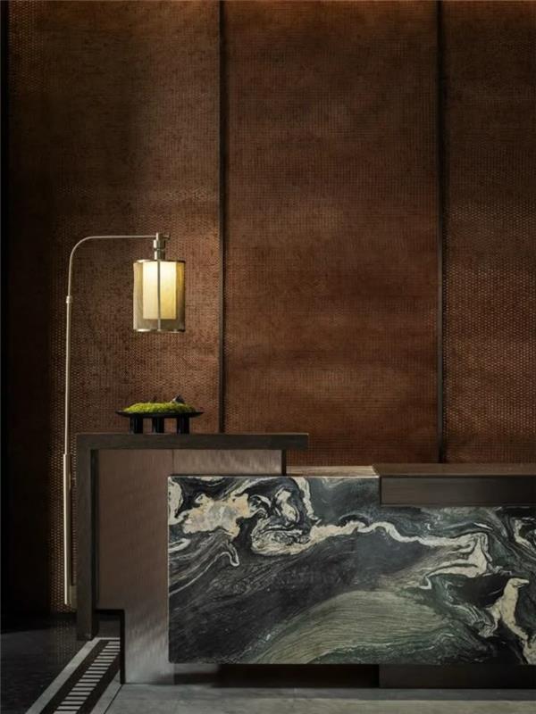
HWCD – Haiyue Huangpuyuan Sales Centre
Colour Through Material
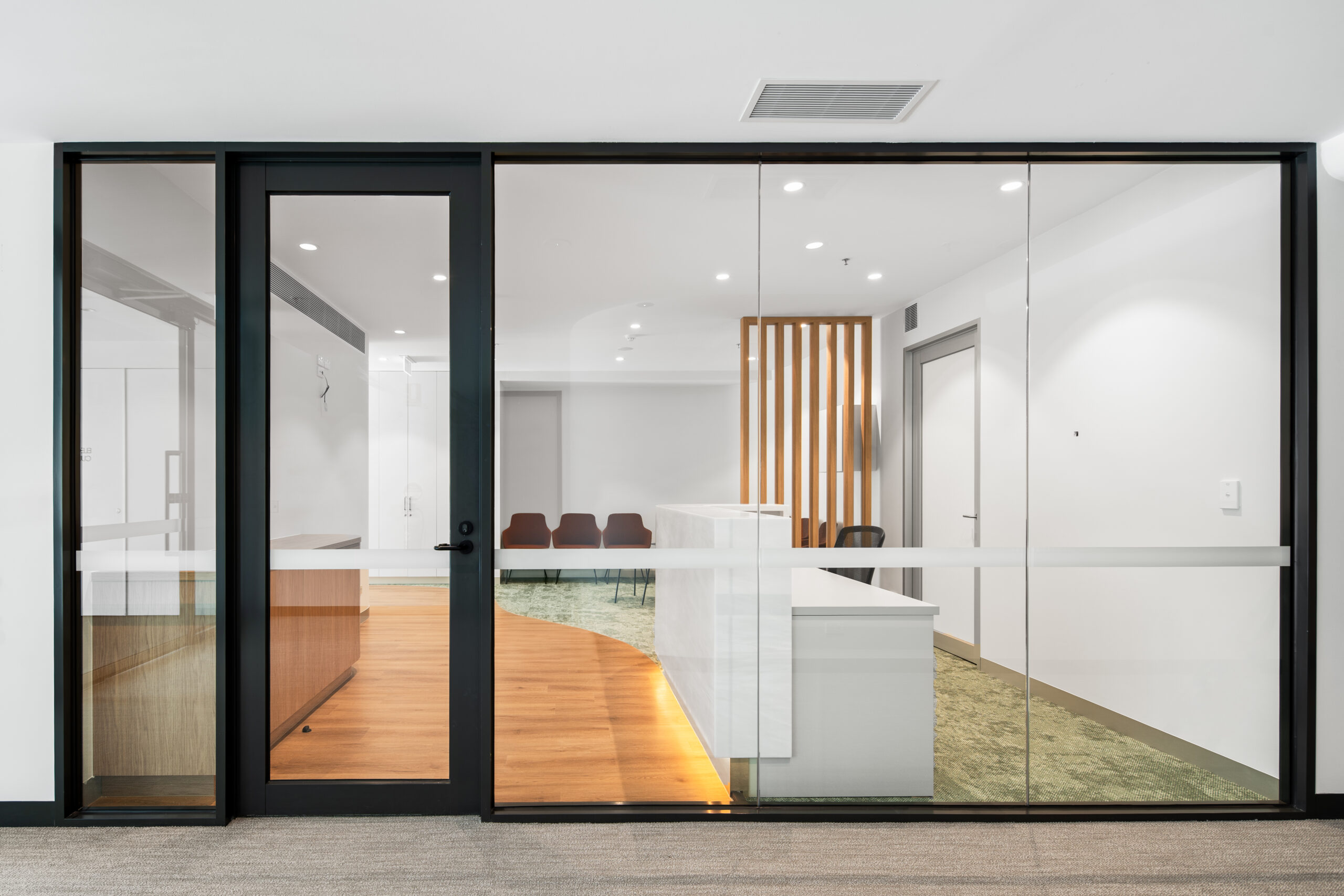
Rather than treating colour as something that sits independently within the design, the tones are carried through a mix of materials and finishes, allowing the palette to build gradually across the space.
This creates a sense of continuity, with colour becoming part of the overall material language rather than a series of isolated accents.
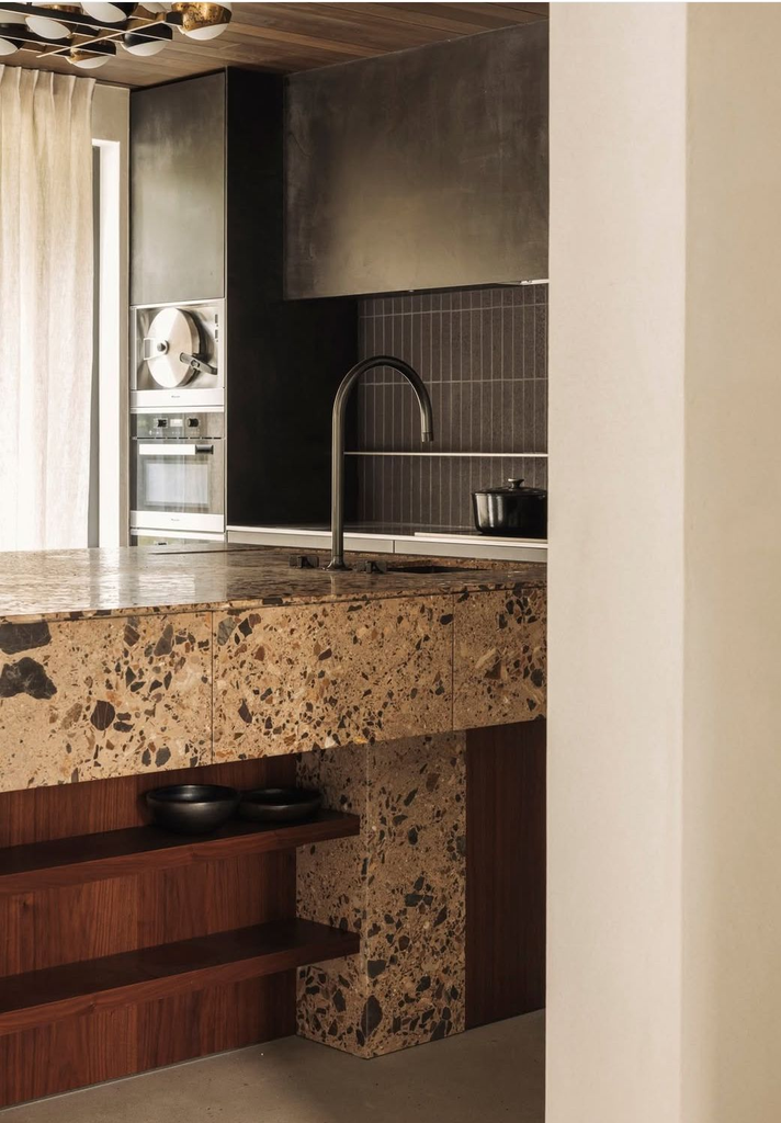
AE Studios – Antwerp
Contrast in Texture and Finish
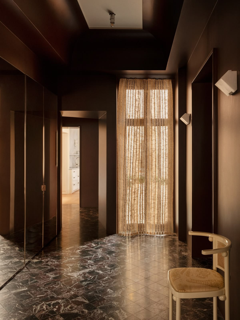
Materiality plays an important role in how the palette is experienced. Solid surfaces are contrasted against metallic details, textured fabrics and transparent elements, allowing the colours to shift through different levels of opacity, reflection and texture.
These material variations create a sense of depth and movement, giving each colour a different presence depending on how it is applied.
Studio Escapist – Grevgatan Home
Balancing Richness and Restraint
The result is a palette that embraces darker and moodier moments while maintaining warmth and approachability.
By balancing rich colour with natural warmth and contrasting material qualities, the scheme demonstrates how darker palettes can feel layered, grounded and considered without becoming overwhelming.
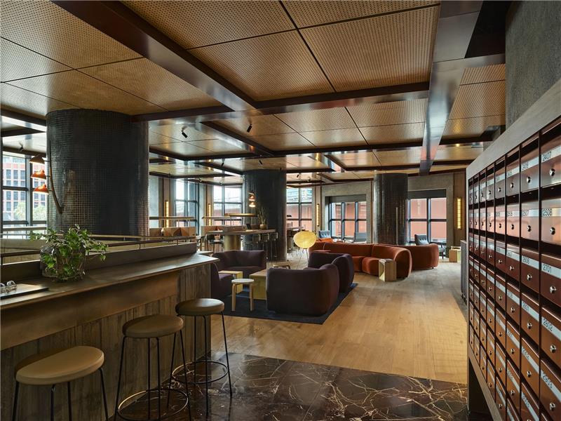
Flack Studios – The Queensbridge Building
Featured Suppliers
- Nero Tapware
- CDK Stone
- Artedomus
- At Work with Camira
- Instyle
- Laminex
- iWood
- Integra Surfaces
- Woven Image
- Tarkett
- Dulux
- Kethy
- Axolotl
- Materialised